Versus Avenue brand kit

Versus Avenue

Brand kit for the TCG selling and trading community

Logo

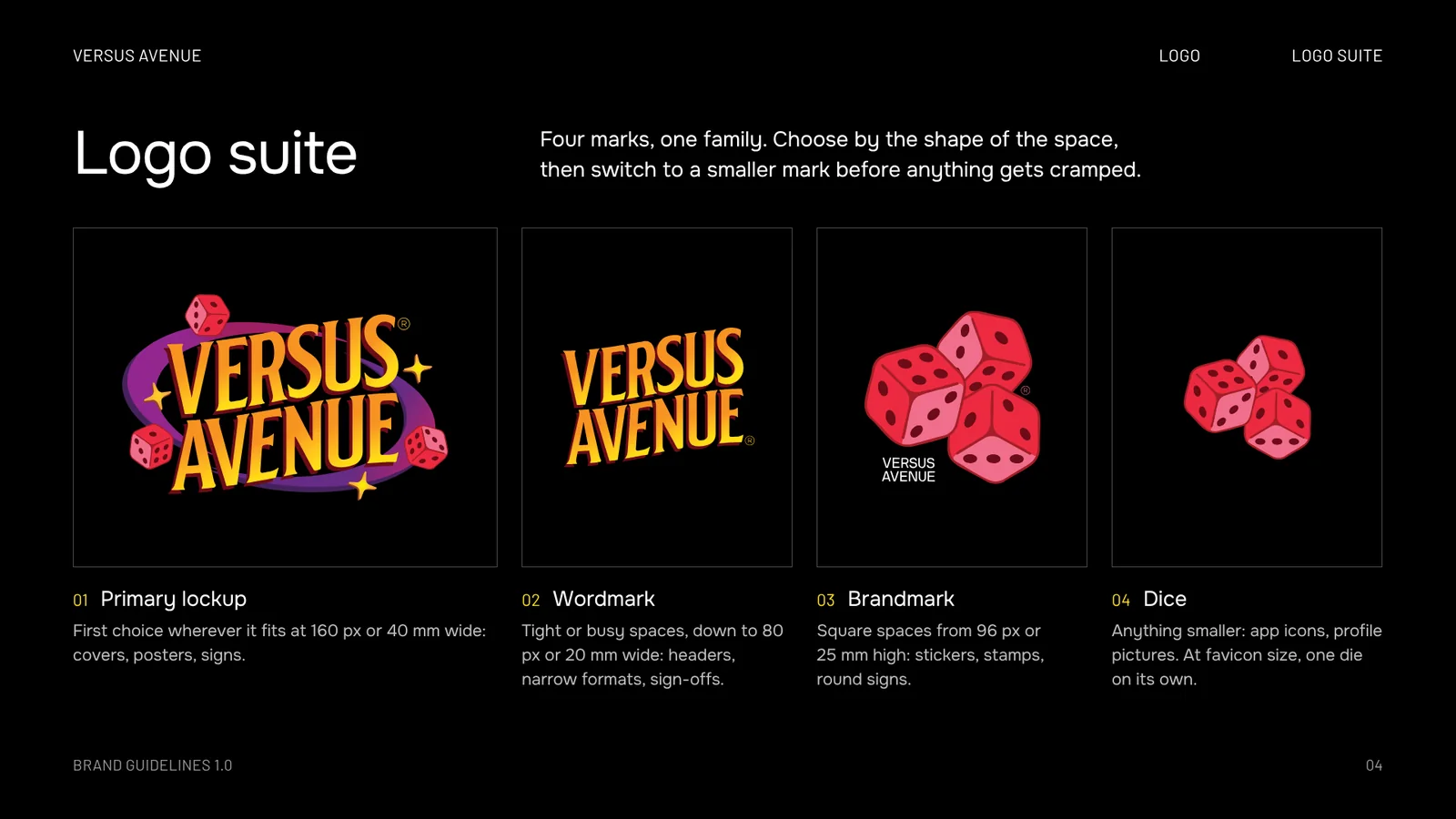
Four marks, one deck

Choose by the shape of the space, then switch to a smaller mark before anything gets cramped. Turn a card over for its rules and its files.

Primary lockup01/04
Use
Covers, posters, signs
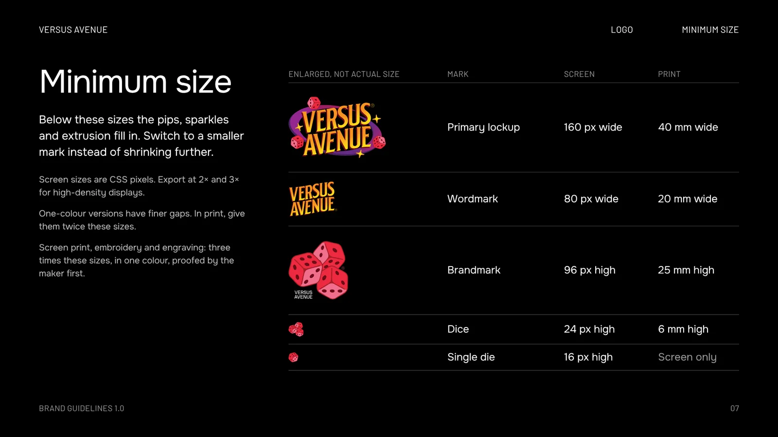
Smallest
160 px or 40 mm wide
Clear
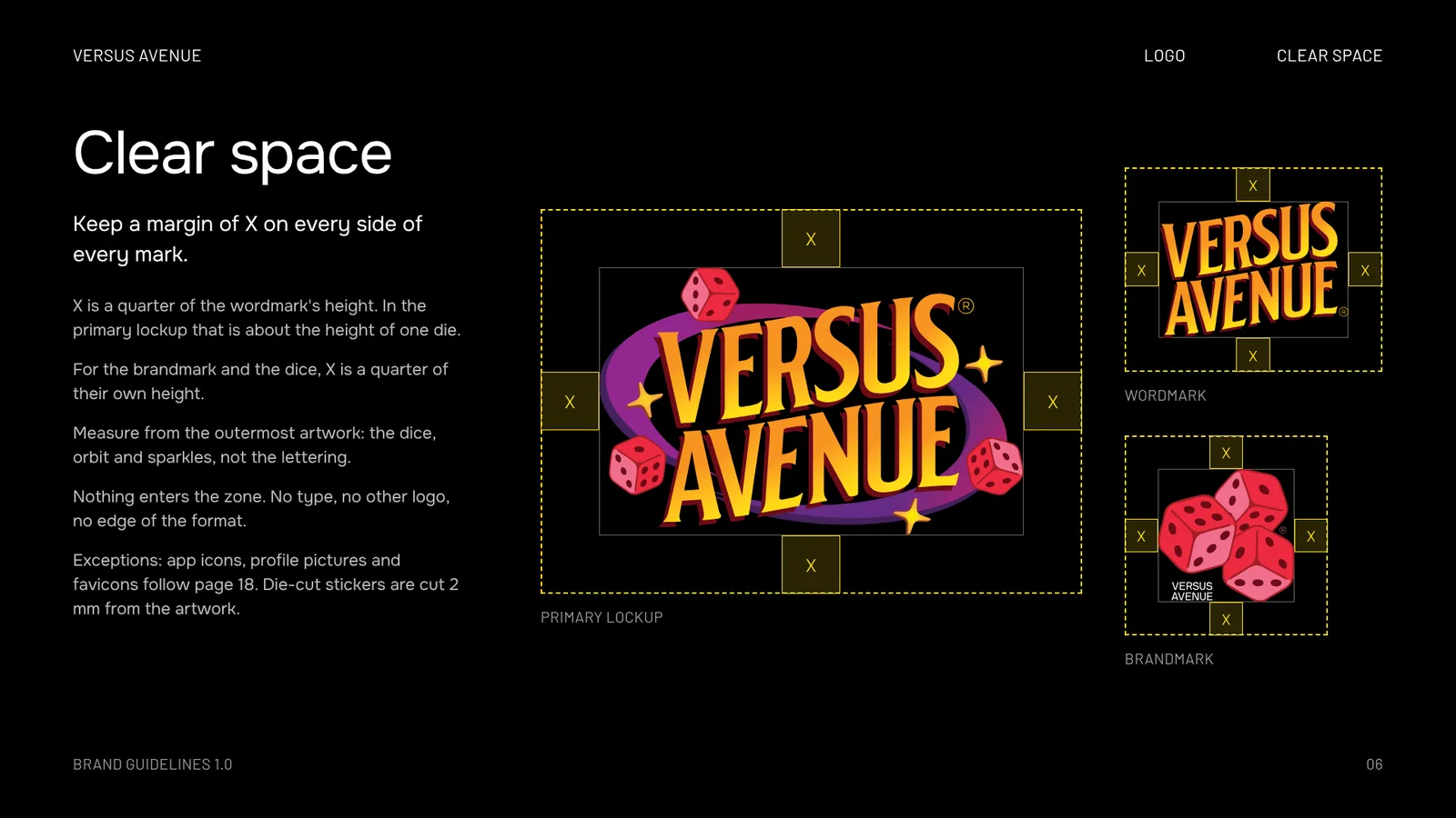
X all round. X is a quarter of the wordmark's height, about one die.
Version
Save a file
Wordmark02/04
Use
Headers, narrow formats, sign-offs
Smallest
80 px or 20 mm wide
Clear
X all round. X is a quarter of its height.
Version
Save a file
Brandmark03/04
Use
Stickers, stamps, round signs
Smallest
96 px or 25 mm high
Clear
X all round. X is a quarter of its height.
Version
Save a file
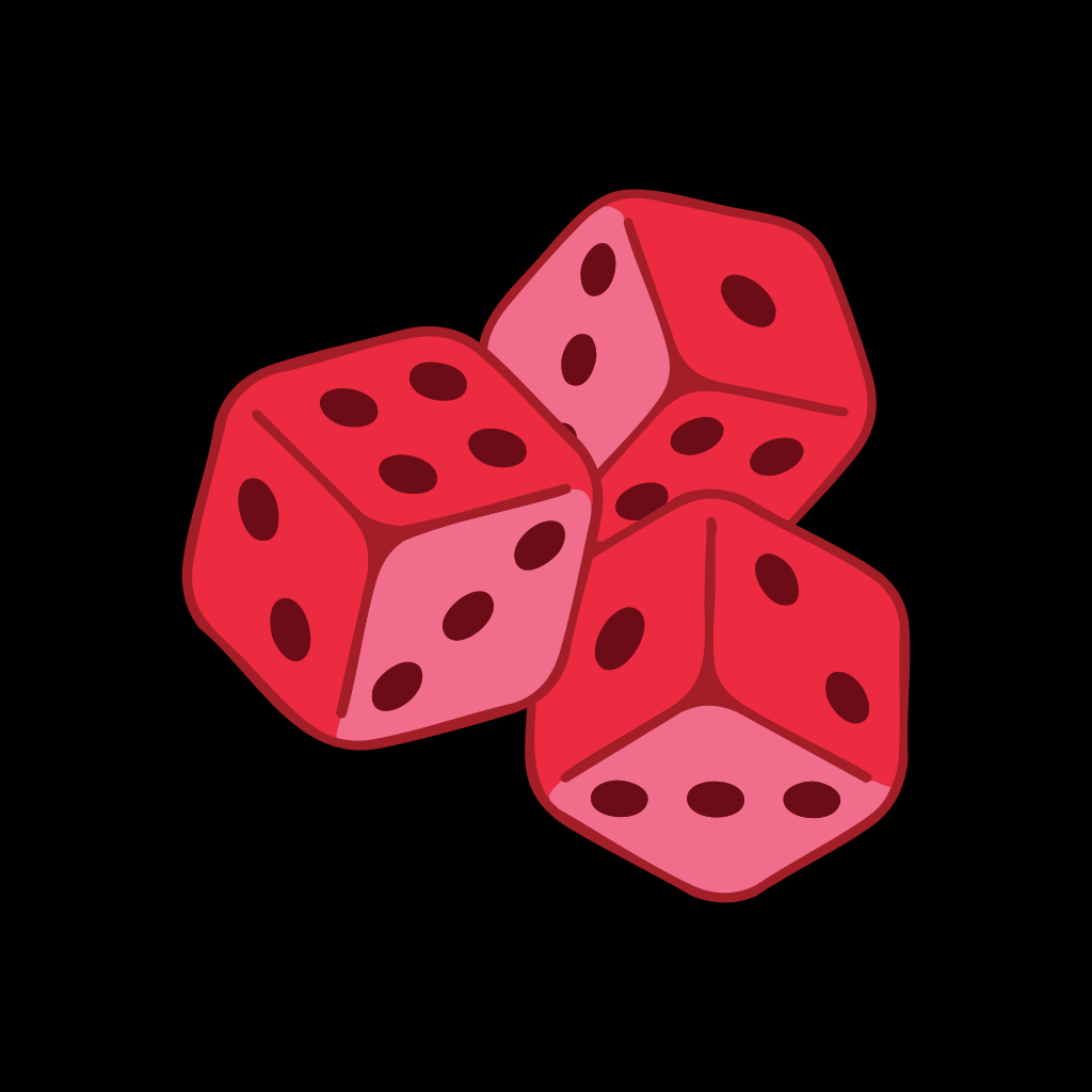
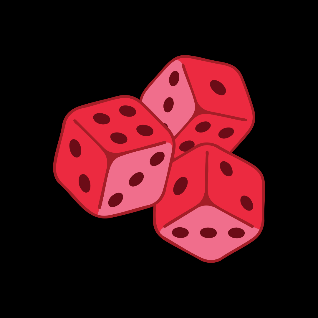
Dice04/04
Use
App icons, profile pictures
Smallest
24 px or 6 mm high. At favicon size, one die.
Clear
X all round. X is a quarter of their height.
Version
Save a file

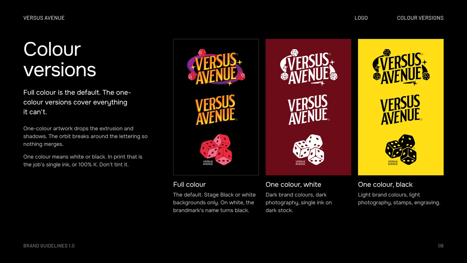
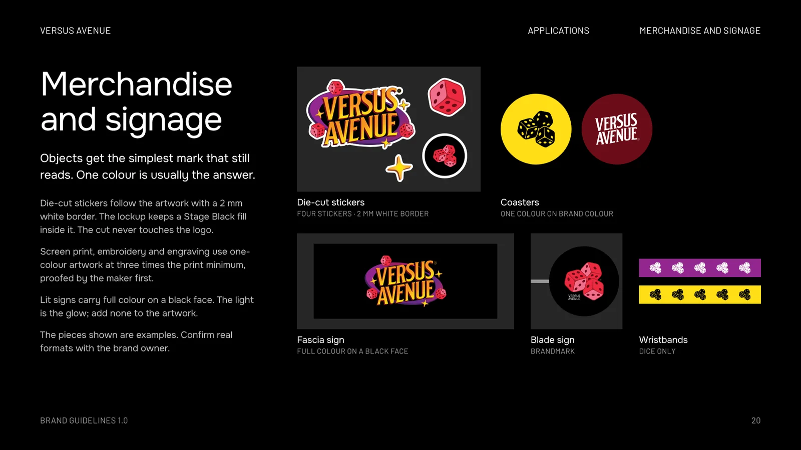
One-colour versions carry finer gaps. In print, give them twice these sizes. For screen print, embroidery and engraving, three times, proofed by the maker first.

Fit check

Which mark fits?

Drag the yellow corner. The page picks the mark for the space, sizes it, and keeps X clear on every side.

520 × 300 px
Primary lockup
Too small
Primary lockup

First choice wherever it fits at 160 px wide.

Size
300 px wide
Clear space
X = 41 px on every side
File
VA_Lockup_FullColour
520
300
Colour

Dark first

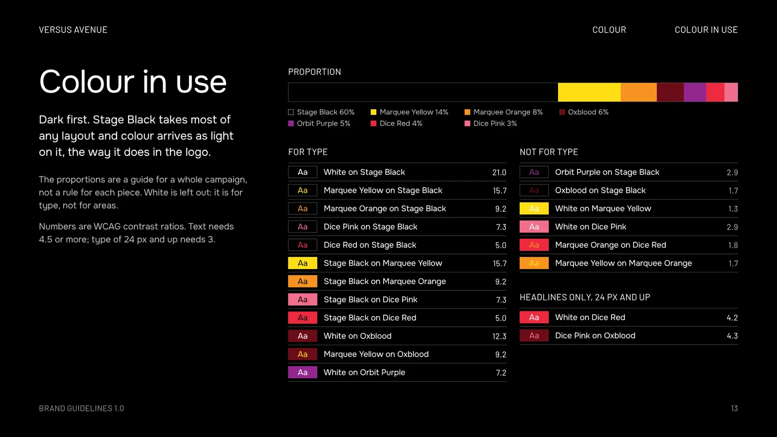
Stage Black takes most of any layout and colour arrives as light on it, the way it does in the logo.

Stage Black 60%Marquee Yellow 14%Marquee Orange 8%Oxblood 6%Orbit Purple 5%Dice Red 4%Dice Pink 3%

A guide for a whole campaign, not a rule for each piece. White is left out: it is for type, not for areas.

Colour versus colour

Pick a type colour and a background. A ratio of 4.5 or more is safe for text. Headlines of 24 px and up need 3.

Type
Background
Marquee Yellow on Stage Black
15.7For type
Tones inside the artwork

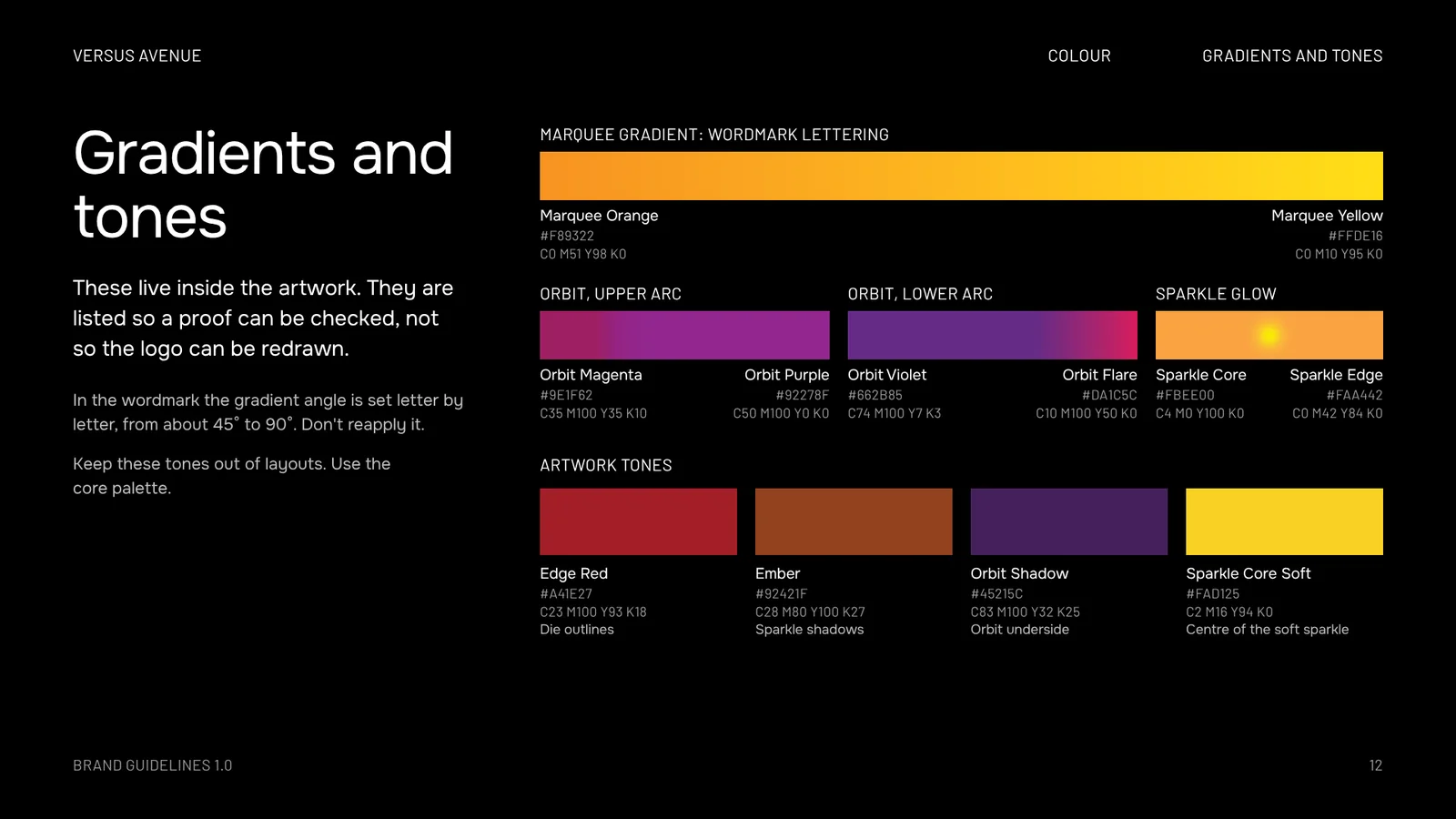
Listed so a proof can be checked. Keep them out of layouts and use the core palette.

Edge Red#A41E27C23 M100 Y93 K18DIE OUTLINES
Ember#92421FC28 M80 Y100 K27SPARKLE SHADOW
Orbit Shadow#45215CC83 M100 Y32 K25ORBIT UNDERSIDE
Orbit Magenta#9E1F62C35 M100 Y35 K10ORBIT, UPPER ARC
Orbit Violet#662B85C74 M100 Y7 K3ORBIT, LOWER ARC
Orbit Flare#DA1C5CC10 M100 Y50 K0ORBIT, LOWER ARC
Sparkle Core#FBEE00C4 M0 Y100 K0SPARKLE CENTRE
Sparkle Edge#FAA442C0 M42 Y84 K0SPARKLE RIM
Sparkle Core Soft#FAD125C2 M16 Y94 K0CENTRE OF THE SOFT SPARKLE

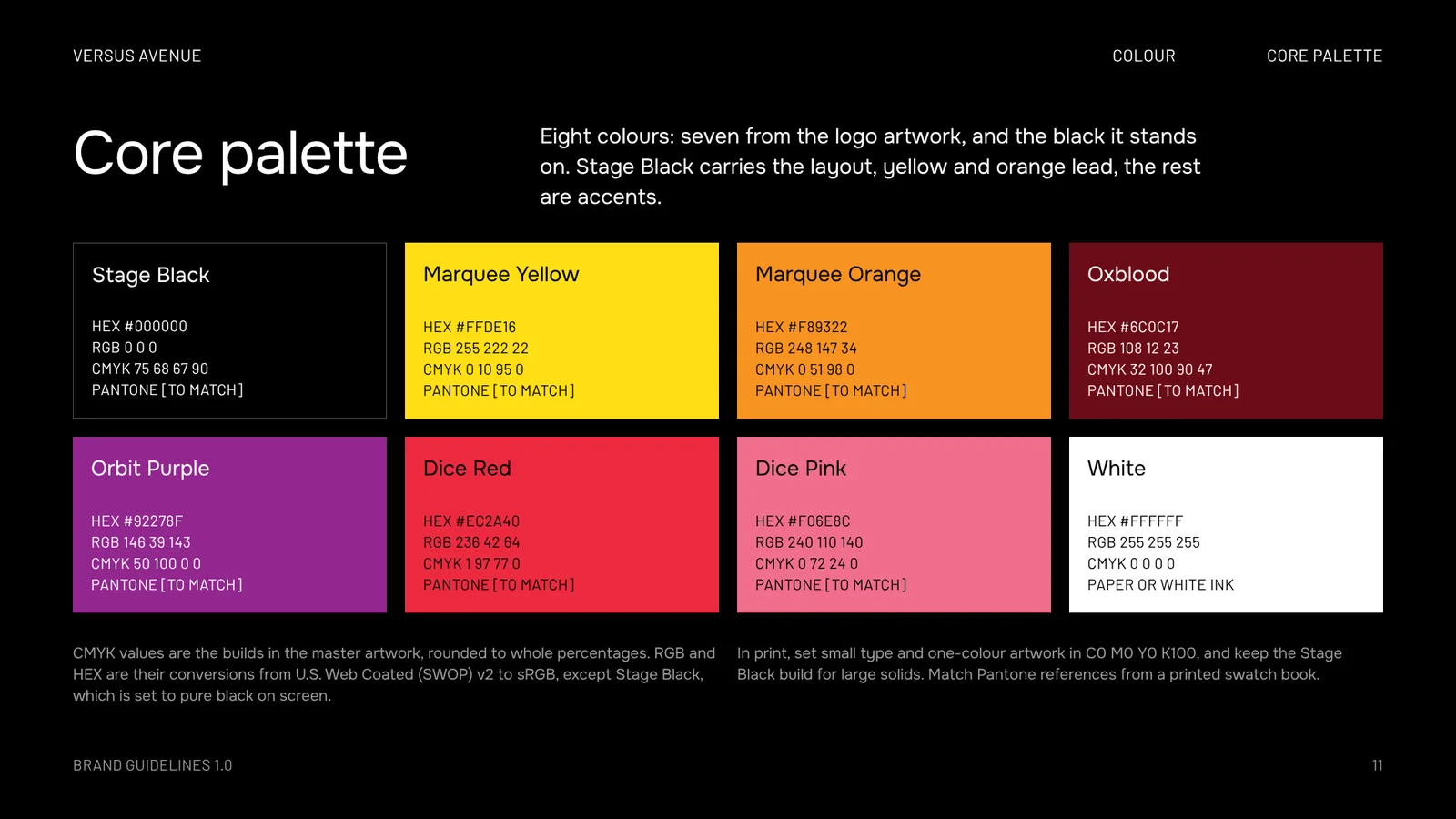
CMYK values are the builds in the artwork, rounded to whole percentages. RGB and HEX are converted from U.S. Web Coated (SWOP) v2, except Stage Black, which is set to pure black on screen. In print, small type and one-colour artwork run in 100% K. No Pantone references are set yet.

Typography

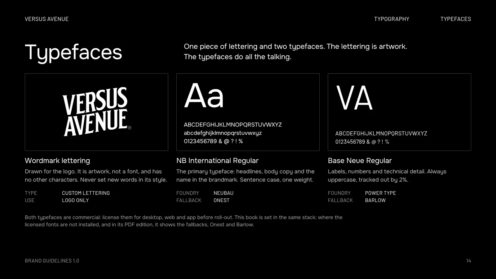
One weight, two faces

Size does the work that weight does elsewhere. Emphasis comes from size, case and colour, never from bold.
ABCDEFGHIJKLMNOPQRSTUVWXYZ
abcdefghijklmnopqrstuvwxyz
0123456789 & @ ? ! %
NB International Regular

Headlines, body copy and the name in the brandmark. Sentence case, set left, ragged right.

Foundry
Neubau
Fallback
Onest
Here
Checking
ABCDEFGHIJKLMNOPQRSTUVWXYZ
0123456789 & @ ? ! %
Base Neue Regular

Labels, numbers and technical detail. Always uppercase, tracked out by 2%.

Foundry
Power Type
Fallback
Barlow
Here
Checking
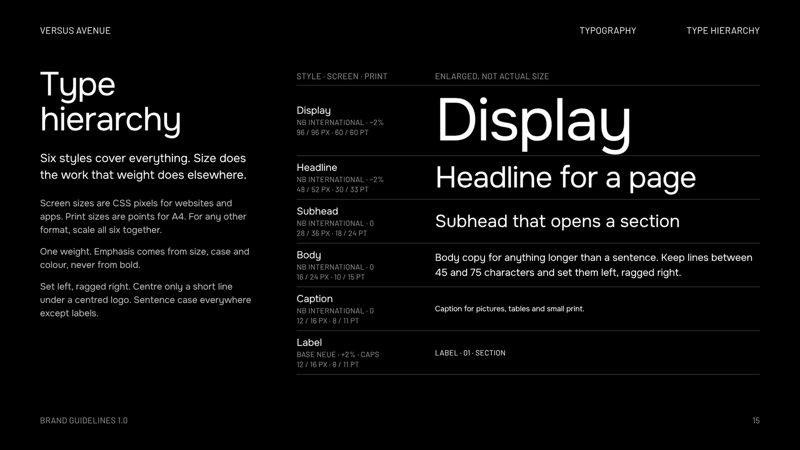
DisplayNB International · −2%96 / 96 px · 60 / 60 pt
Trade night
HeadlineNB International · −2%48 / 52 px · 30 / 33 pt
Trade night
SubheadNB International · 028 / 36 px · 18 / 24 pt
Trade night
BodyNB International · 016 / 24 px · 10 / 15 pt
Body copy for anything longer than a sentence. Keep lines between 45 and 75 characters and set them left, ragged right.
CaptionNB International · 012 / 16 px · 8 / 11 pt
Caption for pictures, tables and small print.
LabelBase Neue · +2% · caps12 / 16 px · 8 / 11 pt
Label · 01 · Section

Screen sizes are CSS pixels for websites and apps. Print sizes are points for A4. Both typefaces are commercial: license them before roll-out.

Graphic elements

Loose pieces

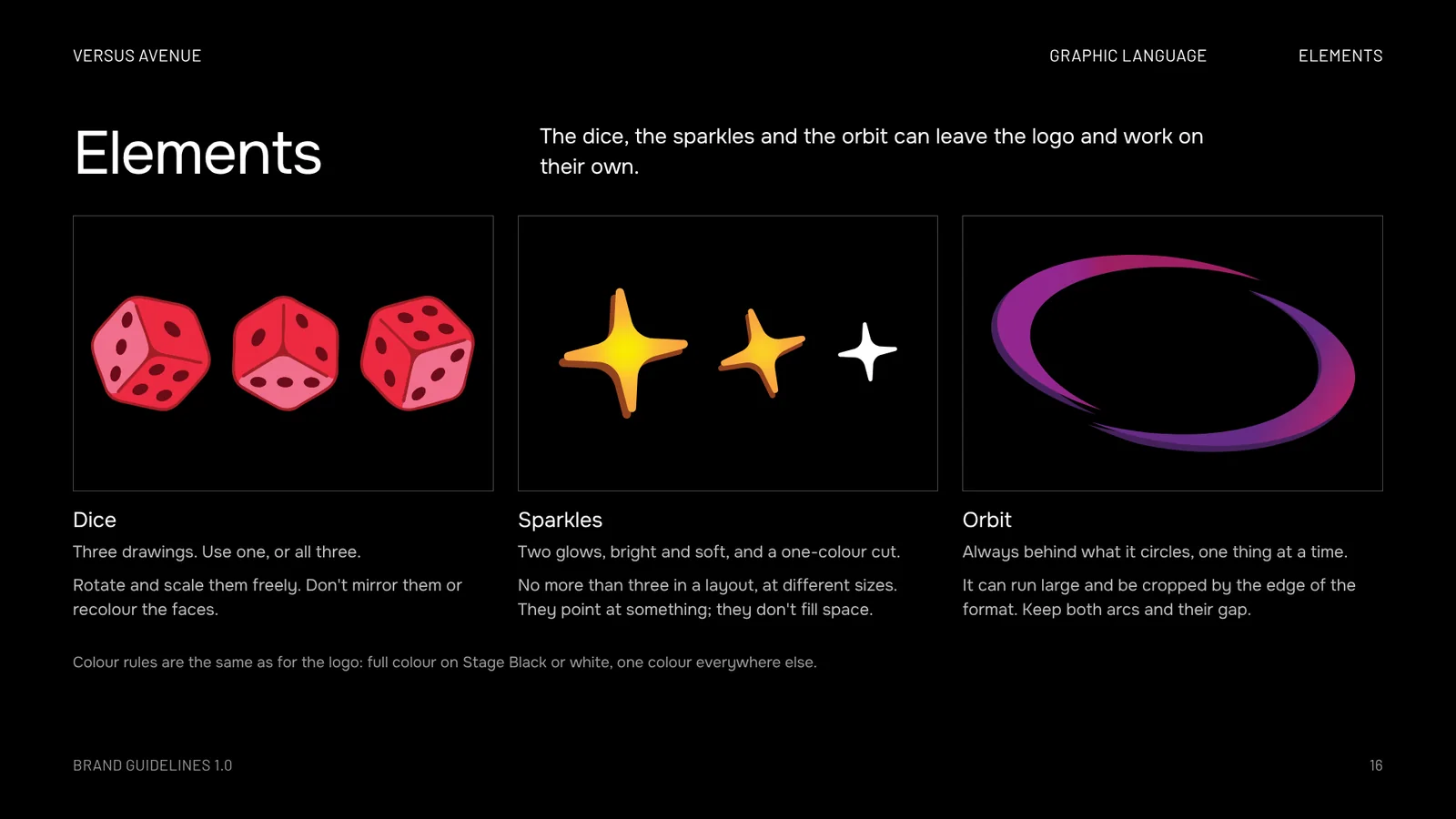
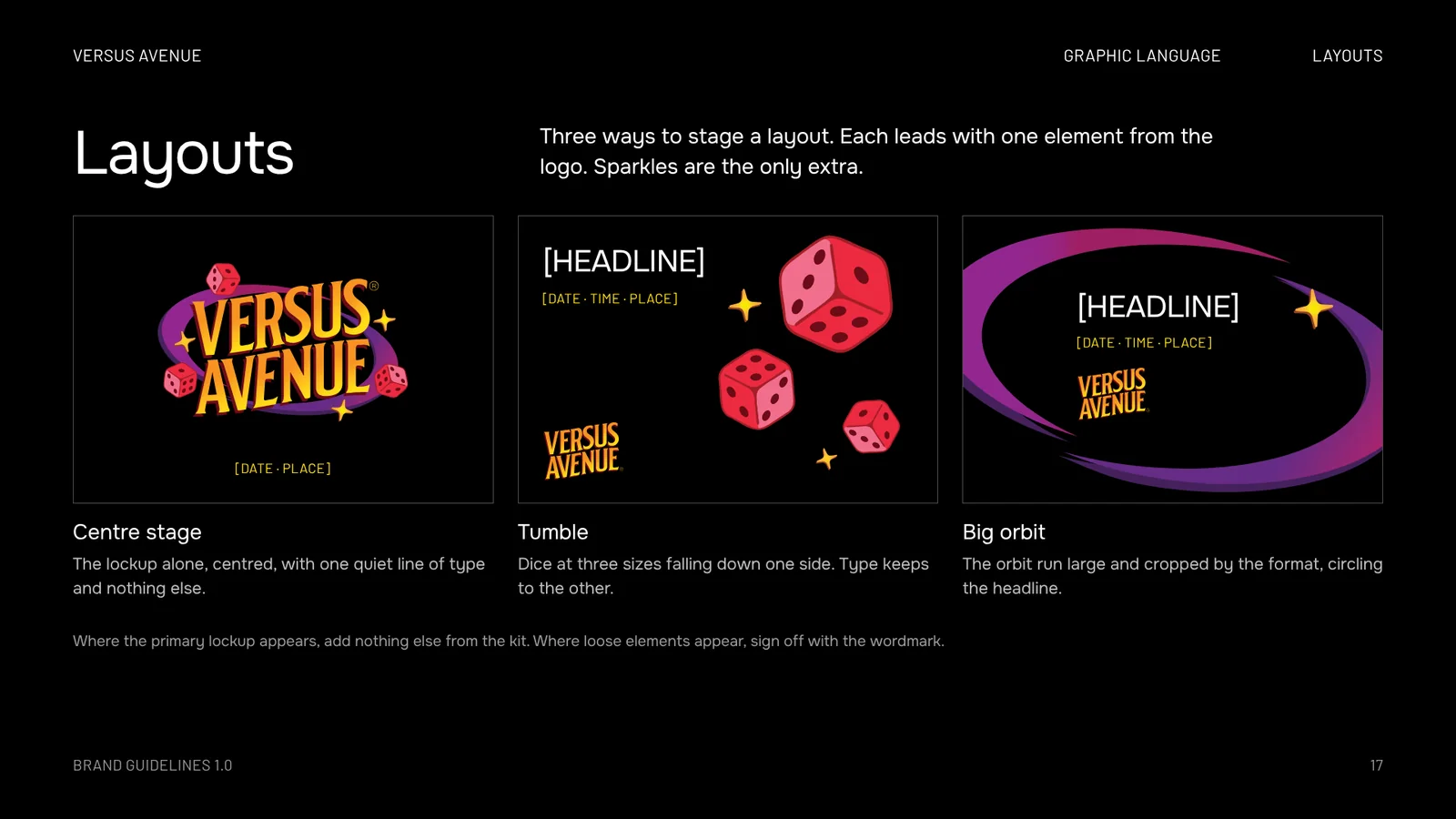
The dice, the sparkles and the orbit can leave the logo and work on their own. Where they do, the wordmark signs off the layout.

Die one Die two Die three

Dice

Three drawings. Use one, or all three. Rotate and scale them freely. Don't mirror them or recolour the faces.

Bright sparkle Soft sparkle One-colour sparkle

Sparkles

Three at most

Two glows, bright and soft, and a one-colour cut. No more than three in a layout, at different sizes. They point at something; they don't fill space.

The orbit

Orbit

Always behind what it circles, one thing at a time. It can run large and be cropped by the edge of the format. Keep both arcs and their gap.

Misuse

The banned list

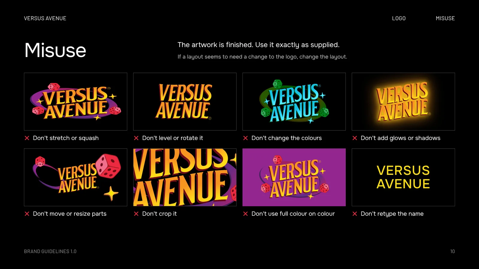
The artwork is finished. Use it exactly as supplied. If a layout seems to need a change to the logo, change the layout.
Or press a tile to put it right
Don't stretch or squash
Don't level or rotate it
Don't change the colours
Don't add glows or shadows
Don't move or resize parts
Don't crop it
Don't use full colour on colour
Don't retype the name
Examples

In play

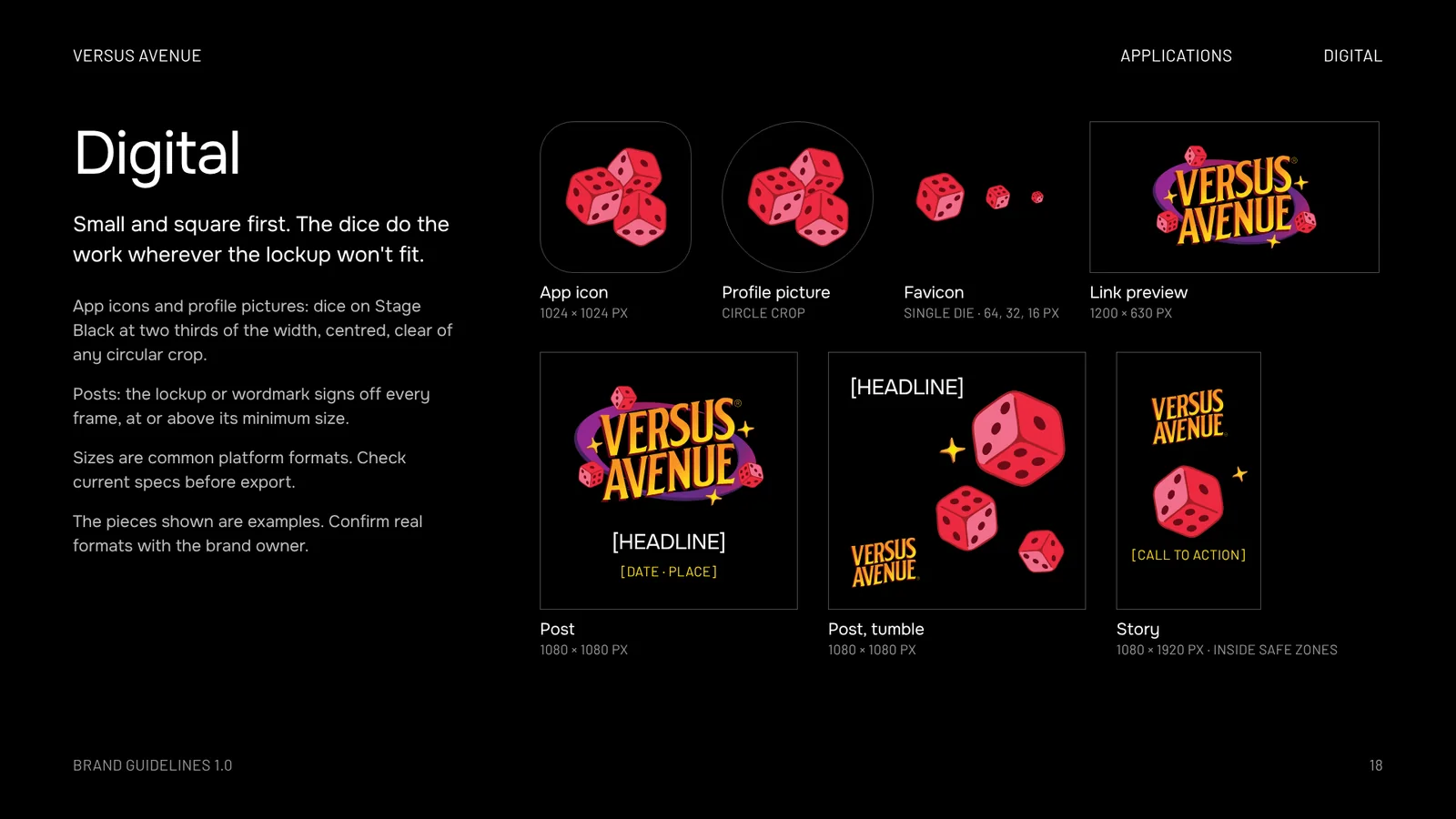
The kit at work on what a card community makes: icons, posts, posters, stickers and sleeves. Every mark keeps its clear space.

App icon: the dice on Stage Black
Profile picture: the dice on Stage Black in a circle
Favicon at 64 pixelsFavicon at 32 pixelsFavicon at 16 pixels
App icon, profile picture, faviconDice at two thirds · single die
Square post with the lockup, a headline and a date
Trade night
Friday · 7 pm
Post1080 × 1080 px
Story with the wordmark, one die and a call to action
See the listings
Story1080 × 1920 px · inside safe zones
Trade night
Friday · 7 pm · Table 12
Yellow poster with the one-colour black lockup
PosterOne colour, black, on Marquee Yellow
Die-cut lockup sticker with a white borderDie-cut die stickerDie-cut sparkle sticker
Round sticker with the dice
Die-cut stickersFour stickers · 2 mm white border
Oxblood card sleeve with the white wordmark
Yellow card sleeve with the black dice
Card sleeves63 × 88 mm · one colour on brand colour
Brandbook

The rules, page by page

Twenty pages on how the identity works, and one to close. Go through them here, or take the PDF.

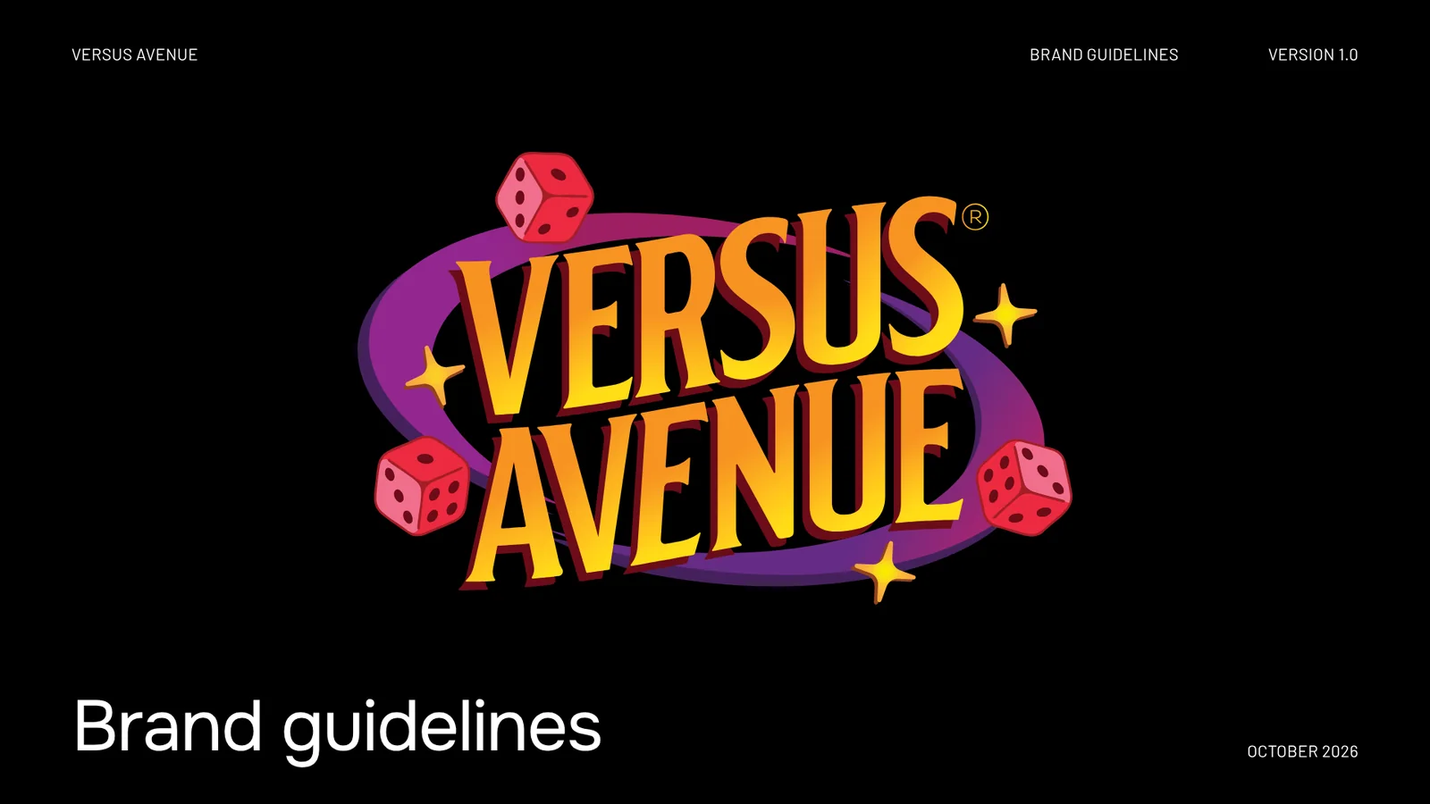
Brandbook page 1: Cover
01Cover
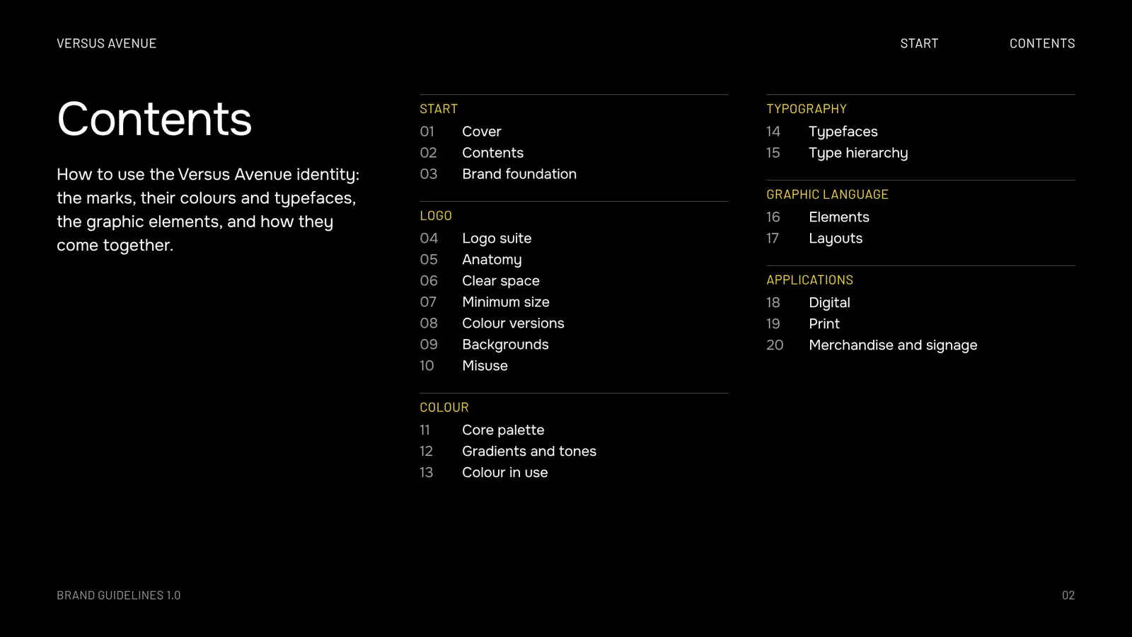
Brandbook page 2: Contents
02Contents
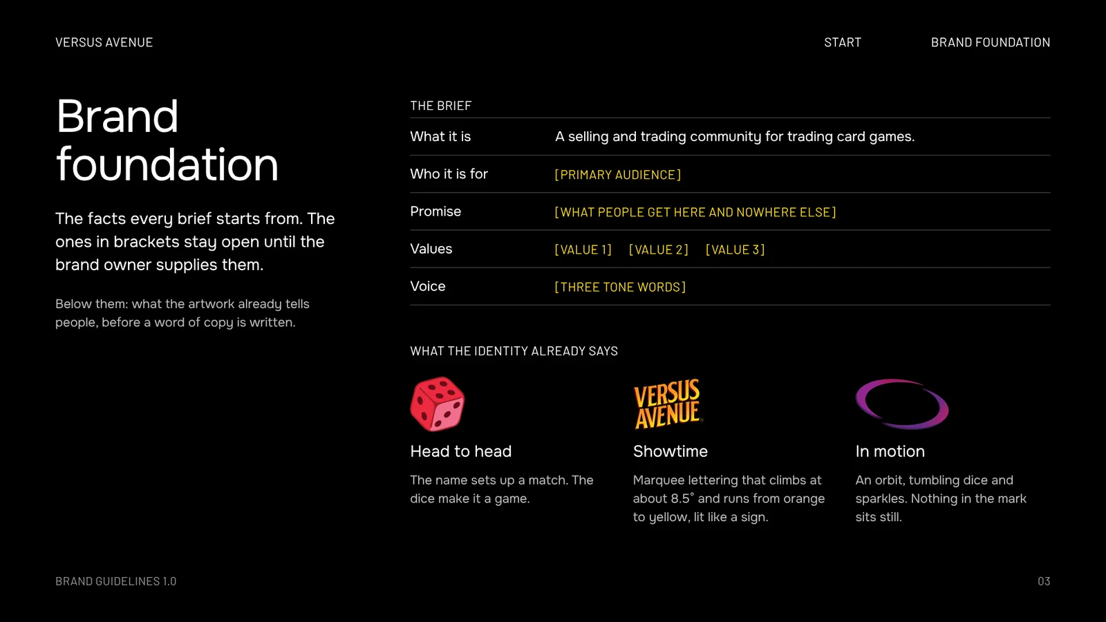
Brandbook page 3: Brand foundation
03Brand foundation
Brandbook page 4: Logo suite
04Logo suite
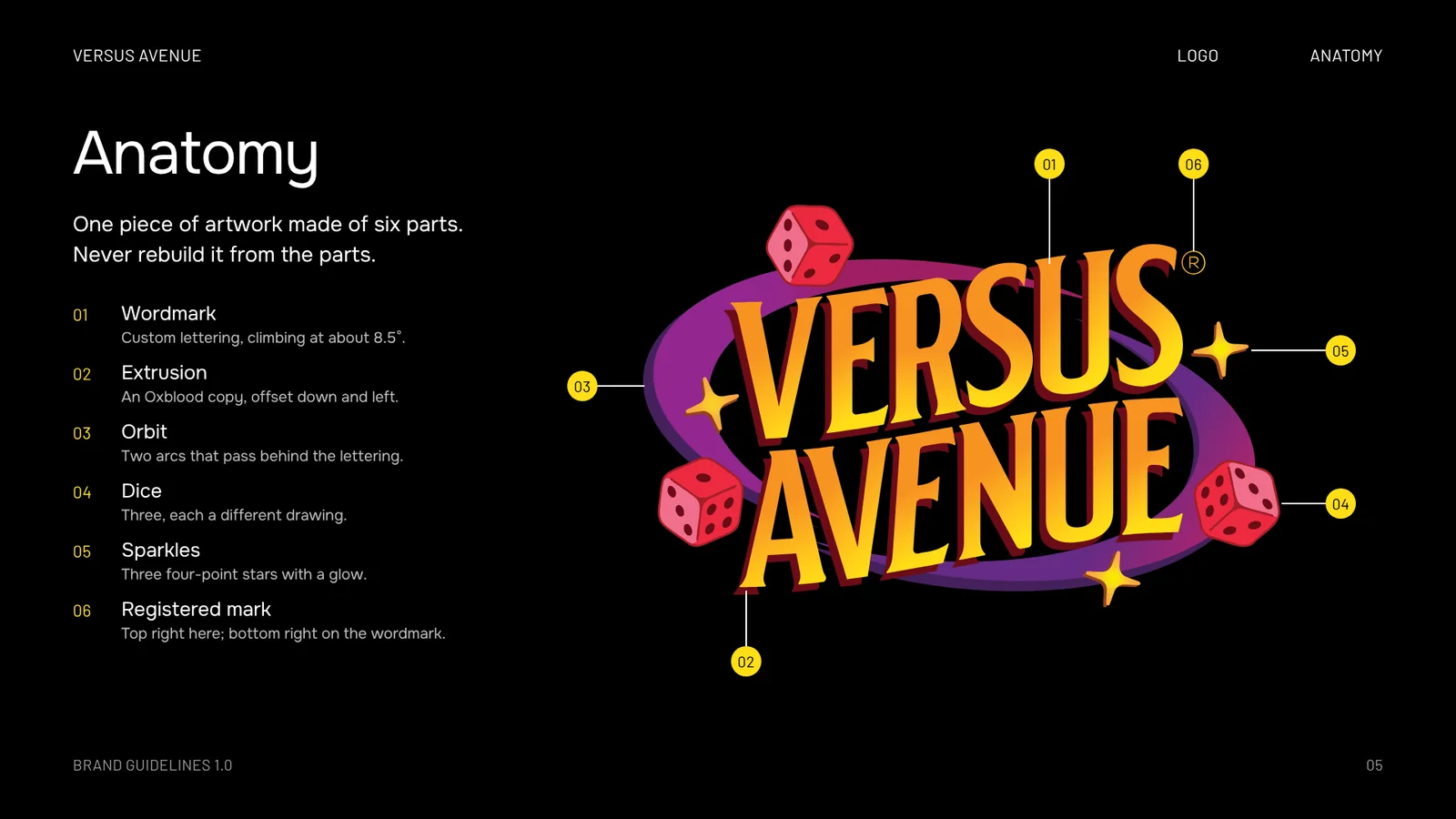
Brandbook page 5: Anatomy
05Anatomy
Brandbook page 6: Clear space
06Clear space
Brandbook page 7: Minimum size
07Minimum size
Brandbook page 8: Colour versions
08Colour versions
Brandbook page 9: Backgrounds
09Backgrounds
Brandbook page 10: Misuse
10Misuse
Brandbook page 11: Core palette
11Core palette
Brandbook page 12: Gradients and tones
12Gradients and tones
Brandbook page 13: Colour in use
13Colour in use
Brandbook page 14: Typefaces
14Typefaces
Brandbook page 15: Type hierarchy
15Type hierarchy
Brandbook page 16: Elements
16Elements
Brandbook page 17: Layouts
17Layouts
Brandbook page 18: Digital
18Digital
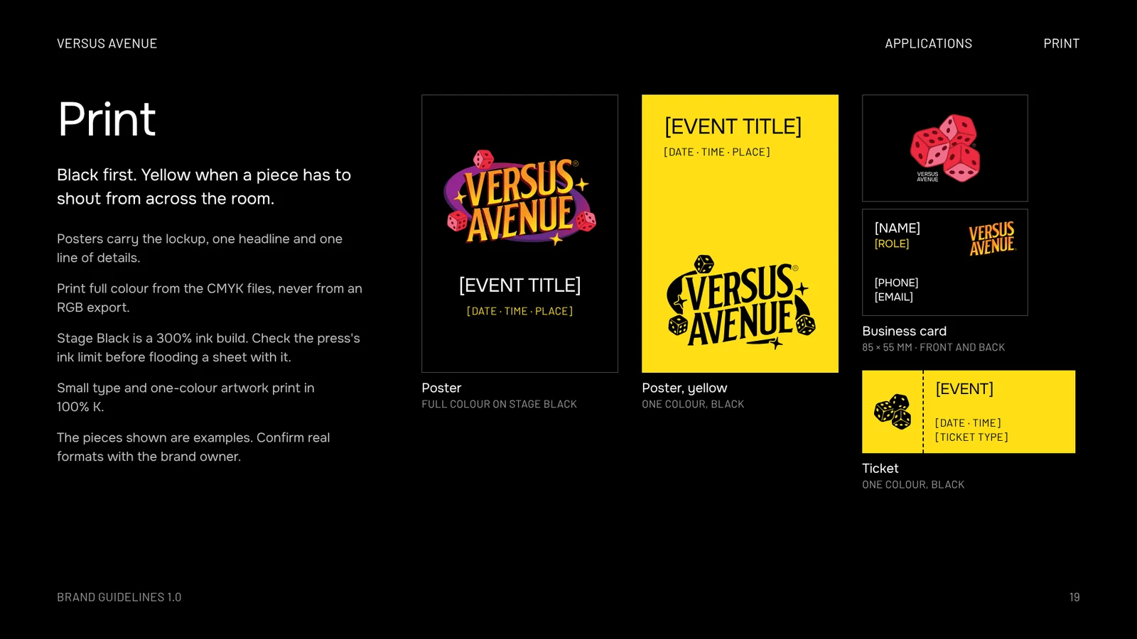
Brandbook page 19: Print
19Print
Brandbook page 20: Merchandise and signage
20Merchandise and signage
Brandbook page 21: Thank you
21Thank you
01 / 21

Versus-Avenue_Brandbook_v1.0.pdf · 21 pages · 3.5 MB. Set in Onest and Barlow, the stand-ins for the two brand typefaces.

Files

The kit

The brandbook, the four marks, the loose elements, icons and swatches. PDF for print, SVG and PNG for screen.

81 files,
one zip
Versus-Avenue_Brand-Kit_v1.1.zip · 6.3 MB
BrandbookThe rules, 21 pagesPDF · 1 file
01_LogoLockup, wordmark, brandmark, dicePDF · SVG · PNG · 39 files
02_ElementsThe dice one by one, the orbit, the sparklesPDF · SVG · PNG · 30 files
03_IconsApp icon, profile picture, faviconSVG · PNG · ICO · 6 files
04_ColourSwatches, values, CSS variablesASE · CSV · CSS · 4 files
READ-ME.txtWhich file to use, and howTXT · 1 file

Print files are vector CMYK in the artwork's own builds. Black versions are 100% K. White versions are 0/0/0/0: paper, or white ink.

Fonts are not in the kit. NB International (Neubau) and Base Neue (Power Type) need a licence from the foundry.